MindSquare
An app that encourages mindful behavior to avoid burnout and reduce isolation among college students.
This was a capstone project for a UX/UI class at Dartmouth College. I collaborated with my co-designer to conduct primary and secondary user research, brainstorm solutions, and create prototypes. The research analysis, features, wireframes, and final screens and prototypes were designed by me.
Timeline: 2 weeks
Team: 2 Product Designers
Role: Research, UX, UI
Deliverables: Design System, Figma Prototype
Our assignment: Create a digital solution that would help connect lonely people.
Background
College students often feel lonely and disconnected.
Problem
My team initially decided to design a digital experience that would help connect lonely college students. However, after conducting interviews and analyzing our users’ needs, we found that the underlying issue had less to do with lack of social connections, but rather that students were feeling isolated due to stress and burnout.
Opportunity
Solution
MindSquare: Destigmatizing the idea of spending time alone through mosaic-based personal time tracking.
Our app allows users to choose between a variety of mosaics to fill with images of mindful activities that they do. Users create and edit their own personal selection of mindful activities that the app will encourage them to participate in.
Users upload images of activities they enjoy doing that are then put into a mosaic, where the user can easily visualize what they have done and be encouraged to continue doing mindful activities. This helps accomplish our goal of creating something that people will become invested in because users are very clearly able to visualize their “progress”.
Each mosaic is made up of a certain number of different mindful activities, such as art, exercise, or journaling, and users must upload a certain number of pictures of them doing each activity to fill the mosaic. This will encourage the user to participate in a variety of different activities that actively require stepping away from studying and doing something mindful.
Users can also view their images in a portfolio-style page. The images are organized by their activity type and can be used as a way to further encourgae users to do more of those activities. Seeing a collection of past activities would hopefully inspire users to do them again.
Our hope is that tracking their mindful activities in this way will encourage people to take breaks from their busy days to pursue and record activities that focus on mindfulness and de stressing, which will ultimately lead to reduced anxiety and loneliness.
Process
User Interviews
In order to learn more about loneliness among college students, we interviewed six current students, all with different backgrounds and experiences.
We asked them to tell us about times when they had felt particularly lonely and particularly connected to others and tried to uncover deeper patterns and pain points.
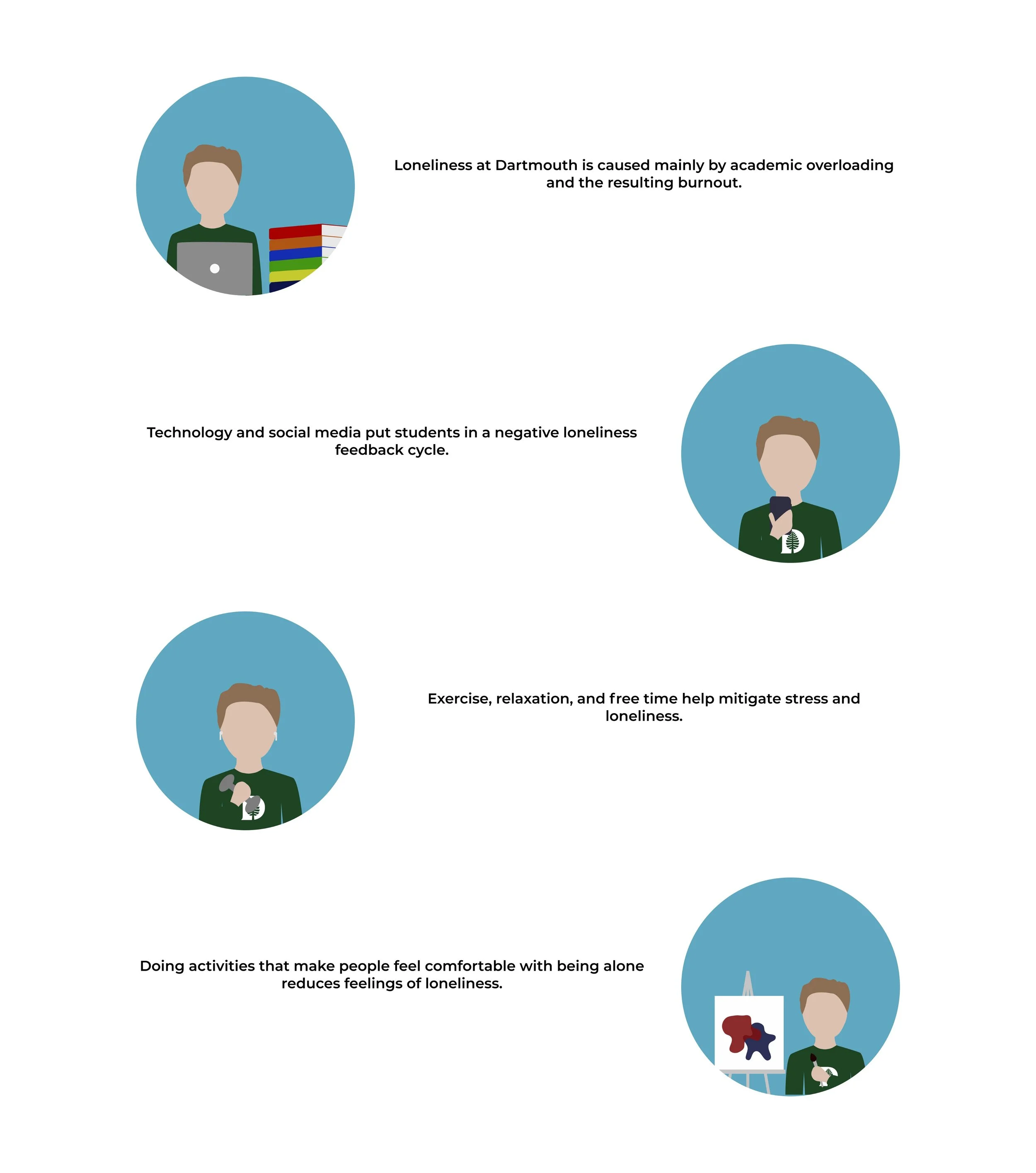
Our main insights were:
Our main finding was:
Personas, Empathy Maps, and Journey Maps
Based on our interviews, I created personas, empathy maps, and journey maps to further understand our users and their needs.
POV Statement
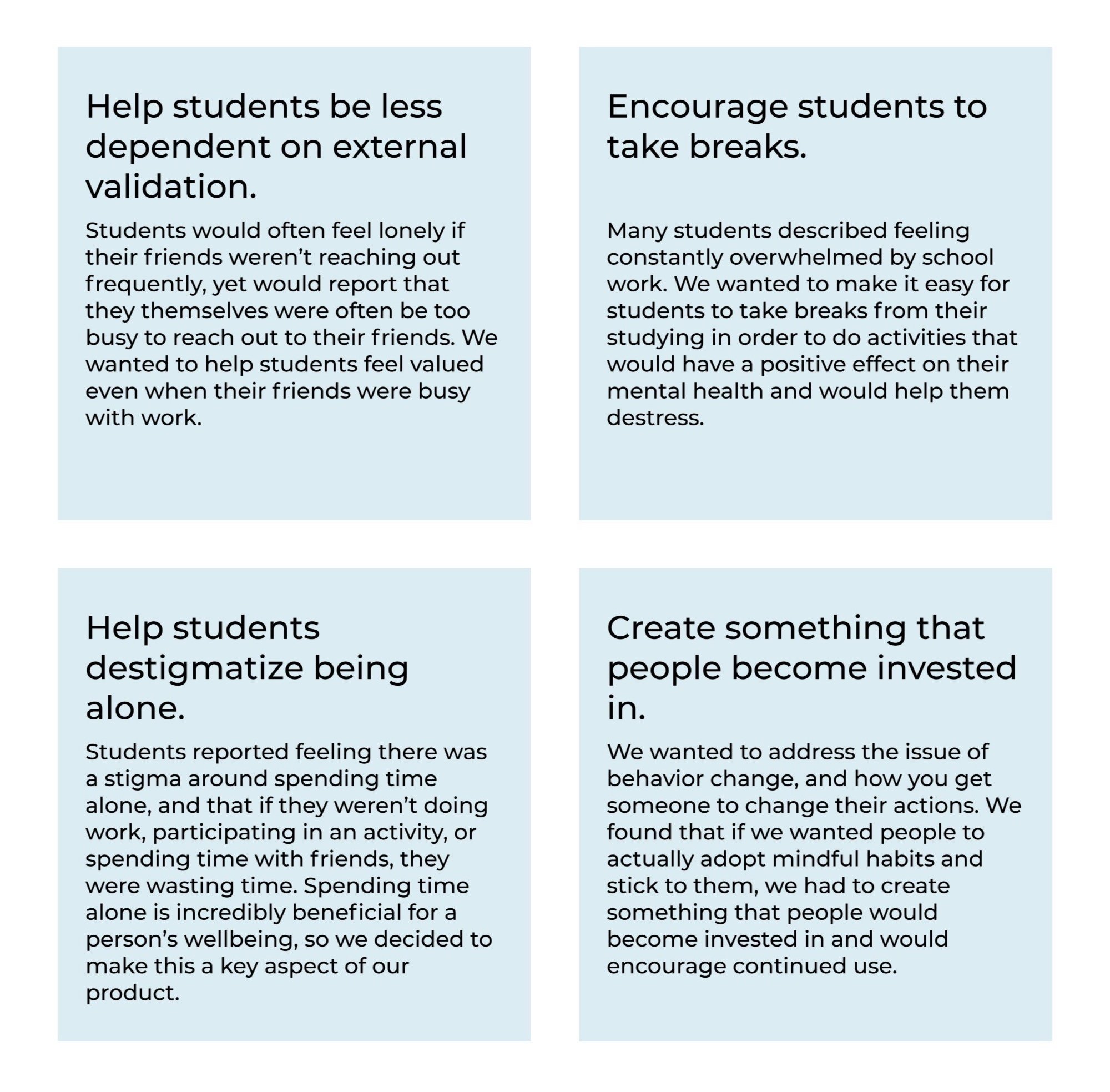
Goals
From our research we realized that our solution would have to address the core issue of academic burnout rather than focus on creating something that would connect people digitally. We decided on four goals for our solution:
Brainstorming
As a team, we conducted several rounds of Crazy-8’s and other brainstorming methods.
I was particularly interested in the behavioral economic theory of narrative visualization and the importance of having tangible visual representations of complex ideas, such as mindfulness.
After our initial brainstorming, I conducted research and found existing analogous solutions that successfully implemented some of the ideas we had thought of. We used these three for inspiration:
-

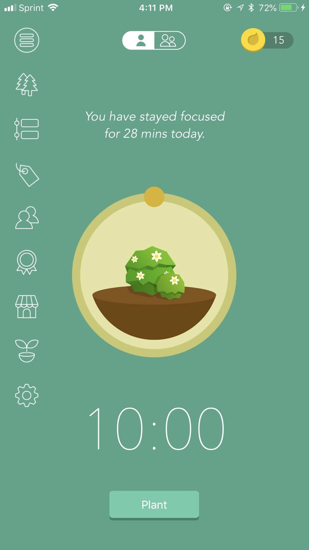
Forest
Forest is an app that plants a virtual tree when you want to stay focused. The tree grows while you work, while leaving the app will cause your tree to die. I wanted to use a similar emotional incentive to encourage people to stick to their mindful behaviors.
-

Bullet Journaling
Bullet journals are an effective tool that encourage daily use because it is really obvious when you skip a day. People don’t like to see a big blank space, and enjoy seeing a nicely finished product, so they are encouraged to keep filling in the journal.
-

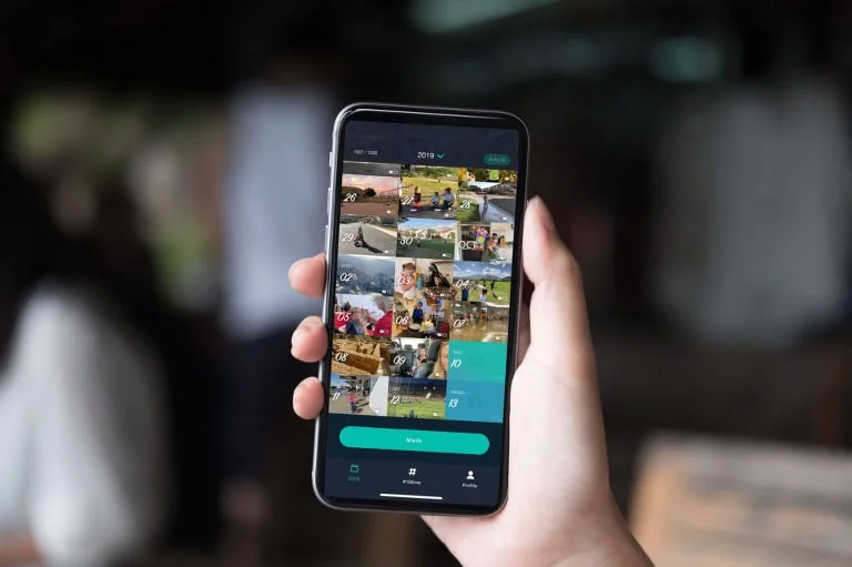
1 Second Everyday
1 Second Everyday is a video-diary app where you take a one second video everyday, which are then compiled into a a movie. People are incentivized to keep using the app because they look forward to a satisfying end product.
I decided I wanted to create something analogous to the bullet journal, that would allow people to have a really clear visual representation of what they have achieved while also making it very clear what they still have left to accomplish.
The bullet journal reminded us of a mosaic, where each individual piece contributed to a greater whole. That lead us to our primary idea:
Due to the short time-frame of our project, we decided to prioritize these MVP features:
Low-Fidelity Wireframes
To get a rough idea of how our app would look and work, I created greyscale mockups based off of some of our sketches. I focused on simple and intuitive screens that would be similar to existing apps that save and categorize images, such as Pinterest and Apple Photos.
Usability Findings
User feedback was overwhelmingly positive and people found the app fairly intuitive. The primary source of confusion was the redundancy of certain features, such as being able to upload images or add activities in multiple places. In my hi-fi mockups, I tried to simplify these features and make them more uniform across the app.
Style Guide
I created a style guide before moving onto high-fidelity mockups. I wanted the app to have a minimal and calming feeling, so I choose clean, sans-serif fonts and drew inspiration from the colors in a sunset for the color palette.
High-Fidelity Mockup
For our class final presentation, I created a Hi-Fi mockup and interactive prototype of our app, which we decided to call MindSquare. I designed all of the screens except for the image upload flow.
Redesign and Interactive Prototype
I initially worked on this project three years ago, so I decided to update the design and create a new interactive prototype. I changed the main user flows to make the app more intuitive and reduce redundancy, and updated the alignments and UI to be cleaner and more visually pleasing.
Reflection and Next Steps
This assignment was my first ever end-to-end UX/UI project, which I completed in spring 2019 after taking an intro to UX/UI class. Given the short timeline and my rudimentary design skills, there is a lot that I would do differently today.
My teammate and I focused heavily on the early user research and UX aspect of the project, and I think we did a good job of finding meaningful user insights. Our greatest success in this project was uncovering a root cause of students’ loneliness and pivoting to design a solution that addressed burnout and stress rather than sticking to our initial prompt of connecting lonely people. My focus on using behavioral economic strategies to promote desirable behaviors was also a strong point of the project.
If I were to do this project again now, I would first have gone wider in the ideation phase of the process and created lo-fi wireframes for a couple of different ideas, rather than diving directly into this one idea. I would also have done more thorough user testing, both through A/B testing and usability testing. Due to the short amount of time, we did only minimal user testing, which was a weakness of the project.
Next steps would be to better address the issue of students not knowing how to productively take breaks or use alone time. This could be done by designing a part of the app where users can explore new mindful activities and get inspiration or by making the components of each mosaic be more specific, such as needing a set number of drawings, nature walks, sun salutations, etc., rather than broader activity categories. Further user research and testing would be needed on this aspect, as well.


